Trading indicators are tools that measure trend, momentum, volume, and volatility so you can plan entries, exits, and risk with clear rules. This guide covers 20 indicators.
You do not need all 20 indicators. Most traders do better with 2 to 3 core indicators, plus a risk tool such as ATR, and use them consistently. The goal is to know when a signal matters and when to ignore it.
What Is VWAP and How Do Traders Use It Intraday?
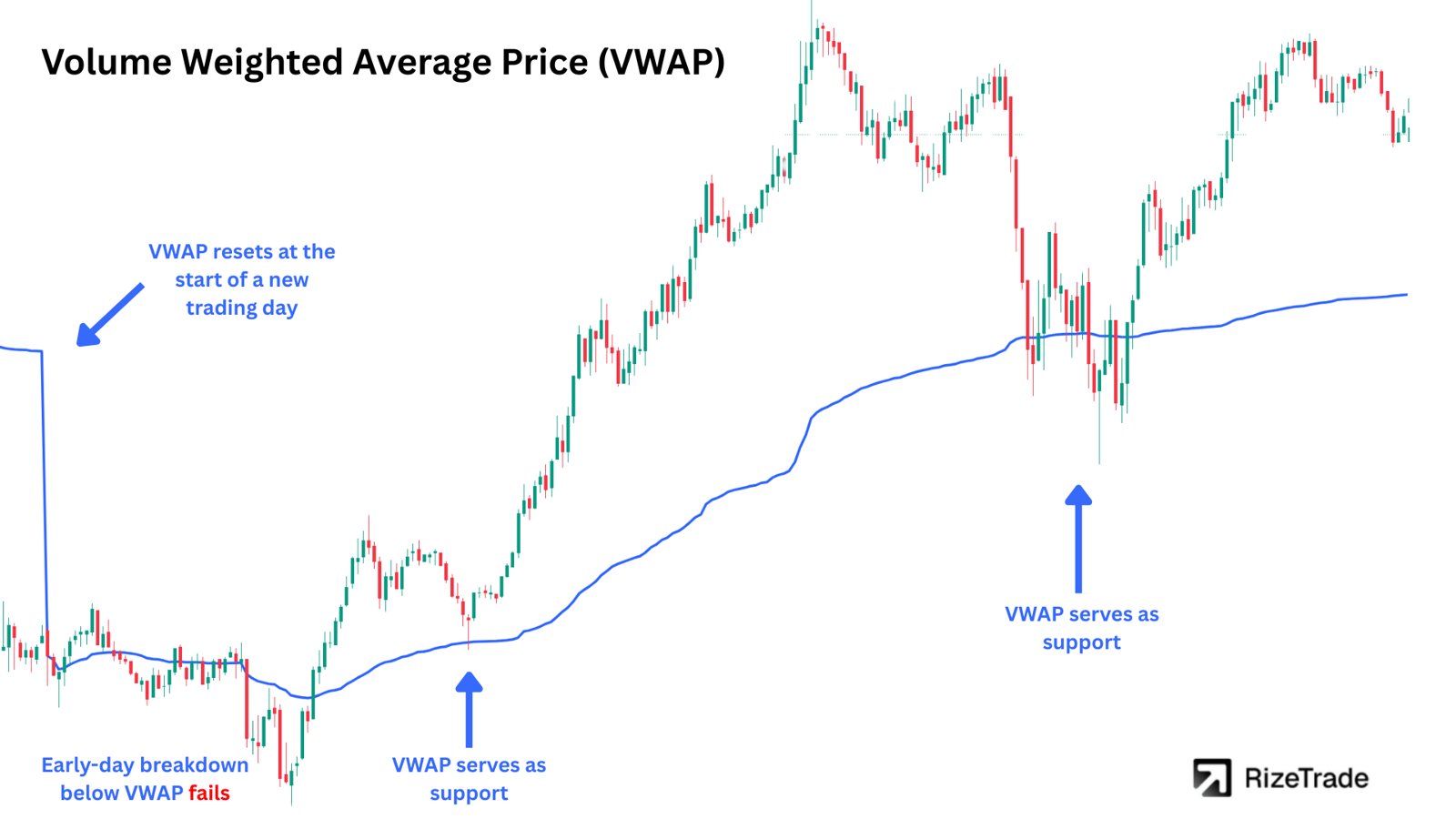
VWAP is the average price weighted by volume, showing where most shares traded during the session. Intraday traders use it as a reference for trend bias, entries, exits, and mean reversion.
Institutions often use VWAP as an execution benchmark. Trades above VWAP can represent poorer fills for buyers, while trades below VWAP can offer better fills. This can make VWAP act as support in an uptrend and resistance in a downtrend.
The standard VWAP resets each day. Anchored VWAP starts from a selected high, low, or other significant point and can show levels that traders continue to watch. A price rejection at VWAP may support a trade idea, while repeated tests can increase the chance of a break.
Example: In an uptrend, price pulls back to VWAP, forms a higher low, and then moves back above VWAP on rising volume. Some traders use that combination as a long trigger, with a stop below the pullback low.
VWAP bands use standard deviations around the main VWAP line. In a strong trend, price may follow the upper band. In a mean reversion trade, a move from the 2 standard deviation band back toward VWAP becomes the target. The source material cites an average 1.8% move in large-cap stocks for this type of setup.
How Do You Use ATR to Measure Volatility and Set Stops?
ATR measures how much price typically moves. Traders use it to set stop losses and position sizes so risk stays more consistent across calm and volatile stocks.
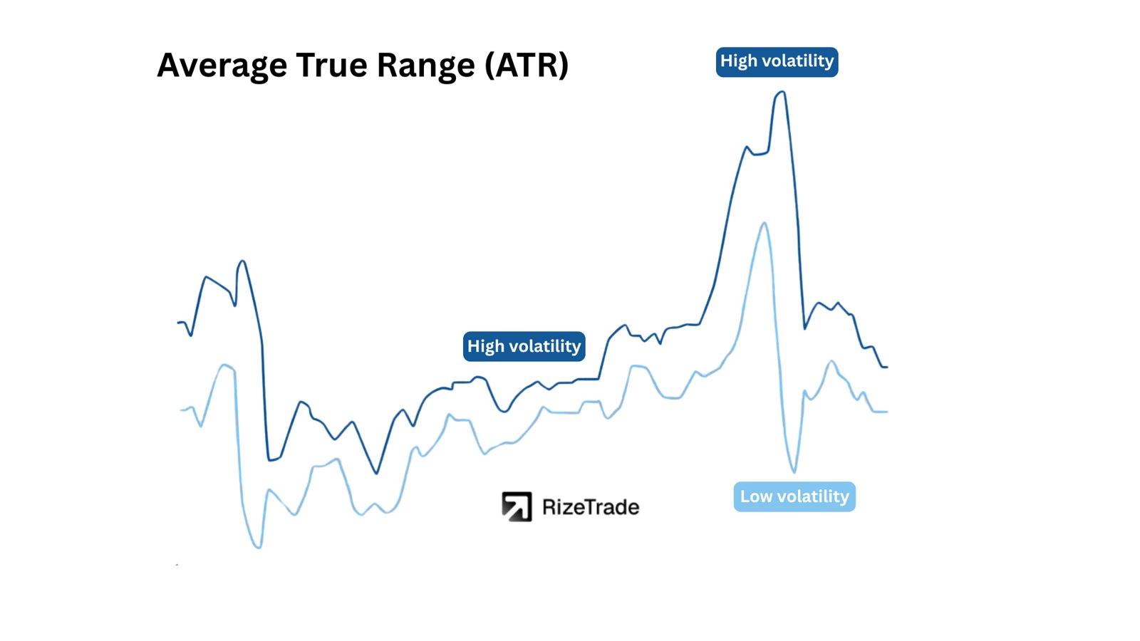
Average True Range, or ATR, measures the average price movement over a set number of bars. Fourteen bars is a common setting. ATR does not predict direction. It only shows the size of recent price movement.
A stock with a $2 ATR moves about $2 on average over the measured period. Many profitable trading strategies use ATR when placing stops. For example, a long trade might use a stop 1.5 times ATR below the entry price.
Stop placement: An entry at $100 with a $2 ATR gives a 1.5x ATR stop distance of $3, placing the stop at $97.
Position sizing: If you risk $300 and your ATR-based stop is $3 away, the position size is about 100 shares.
ATR can also help compare positions with different volatility levels. A trader may take more shares of a stock moving 0.5 ATR and fewer shares of a stock moving 15 ATR. The source material states that this adjustment cuts drawdowns by 30% on average.
ATR often rises during earnings and major news events. A stop based on yesterday's normal range may be too close when volatility expands overnight.
How Do Traders Use the Simple Moving Average (SMA) for Trend and Support?
SMA shows the average closing price over a set period. Traders use it to define trend direction and identify moving areas of support and resistance.
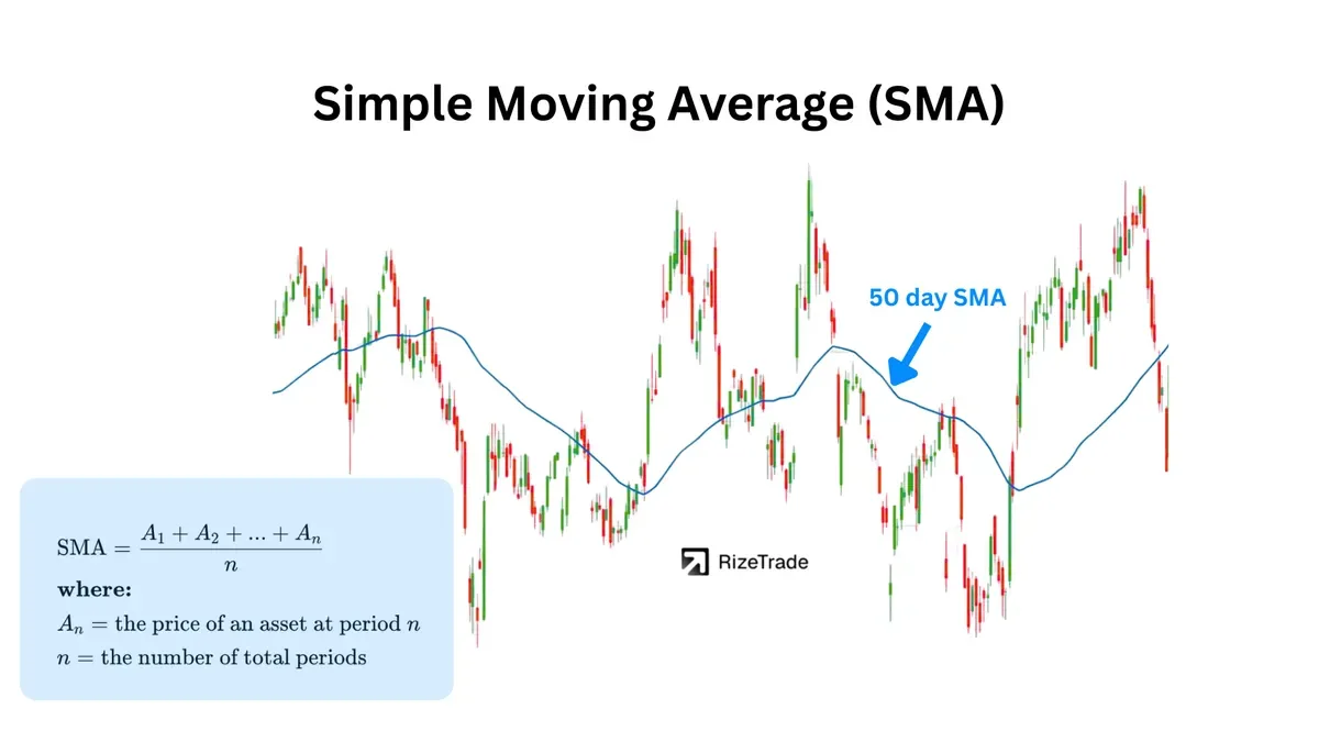
The Simple Moving Average calculates the arithmetic mean of closing prices over a selected number of periods. It smooths some of the day-to-day price movement, making the broader trend easier to see.
The 50-day SMA is commonly used to track an intermediate trend. The 200-day SMA is used to assess a longer-term trend.
Trend filter: Price above the 200-day SMA can support a long bias. Price below it can support a short bias or discourage long trades.
Support and resistance: In an uptrend, traders often watch pullbacks to the 50-day SMA for support.
A moving average cross is one way to use an SMA, but it is not the only way. A price reaction at the 50-day SMA can provide more context than a single close above or below the line. A third test of the same level may also behave differently from the first, so traders should plan for either a bounce or a break.
The 50-day and 200-day SMA crossover is known as the golden cross when the shorter average moves above the longer one. Volume can add context. A cross with above-average volume may attract more participation, while a low-volume cross may fail.
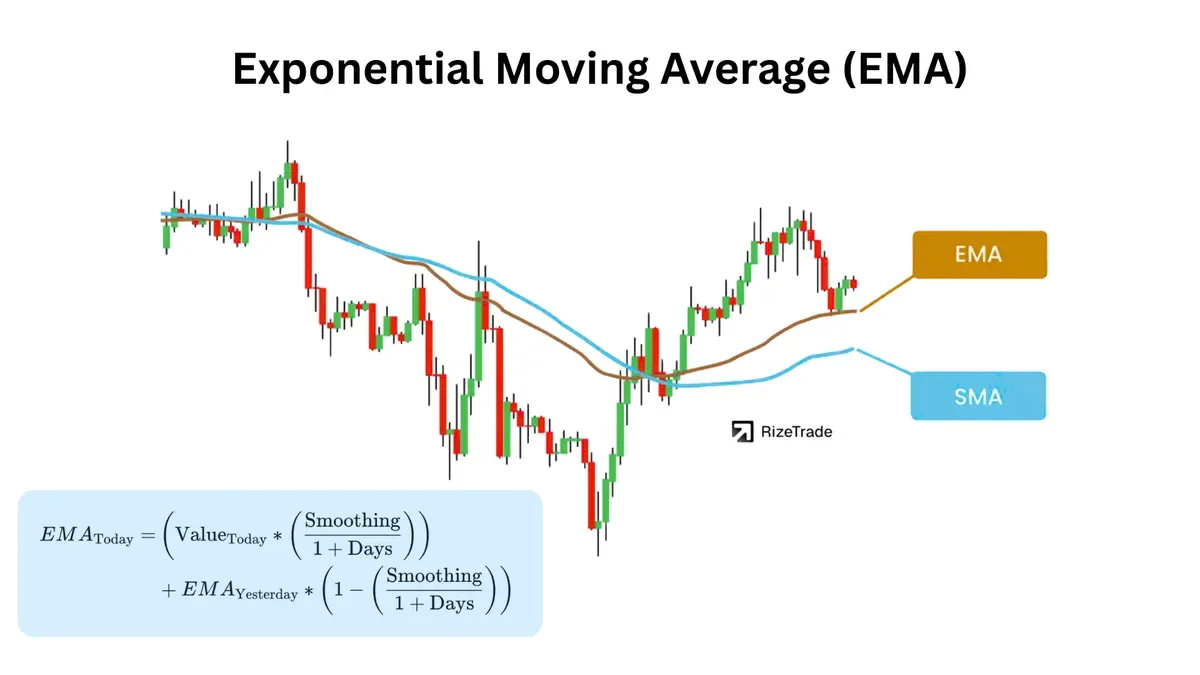
How Does EMA Help You Spot Momentum Shifts Faster?
EMA reacts faster than SMA because it gives more weight to recent prices. Traders use it for quicker momentum signals, particularly on shorter timeframes.
The Exponential Moving Average responds more quickly to new price data than a simple moving average. That speed can help traders identify a change earlier, but it can also create more false signals.
The 9 and 21 EMAs are commonly used to frame short-term momentum. When the 9 EMA moves above the 21 EMA, traders may read it as improving momentum. The 12 and 26 EMAs are used in the MACD calculation, so many traders watch those levels as well.
An EMA ribbon uses several averages, such as 8, 13, 21, 34, and 55 periods. When the averages spread apart, momentum is increasing. When they move closer together, the trend may be losing force.
EMAs can produce repeated signals when price moves sideways. In a range, traders may prefer slower moving averages or combine the EMA with a separate trend filter.
How Do You Use MACD Crossovers, Histogram, and Zero-Line Signals?
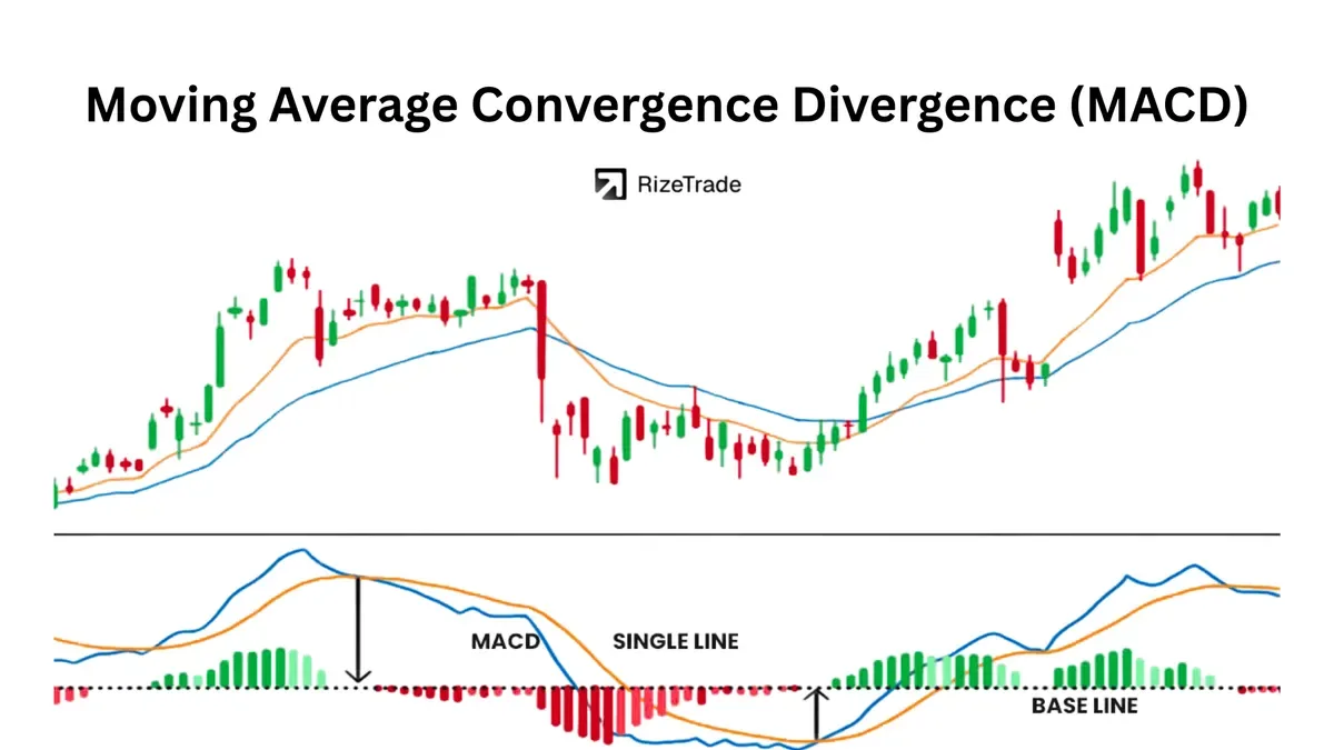
MACD compares two EMAs to show momentum and trend changes. Traders use the signal-line crossover, histogram, and zero-line position to assess entries and trend direction.
Moving Average Convergence Divergence, or MACD, compares the 12 EMA with the 26 EMA. The signal line is usually a 9 EMA of the MACD line.
A MACD line crossing above the signal line can produce a bullish signal. A histogram that begins expanding can show increasing momentum, while a shrinking histogram may warn that momentum is slowing. Divergence between price and the histogram can appear before the lines cross.
Zero-line cross: MACD above zero suggests a bullish structure. MACD below zero suggests a bearish structure.
Timeframe filter: Some traders use the weekly MACD to filter daily signals, taking daily long trades when the weekly MACD is rising.
MACD can lag during a strong trend and produce repeated signals in a range. When the histogram bars shrink near zero, price may be entering a period of compression with fewer clean signals.
How Does RSI Identify Overbought, Oversold, and Divergences?
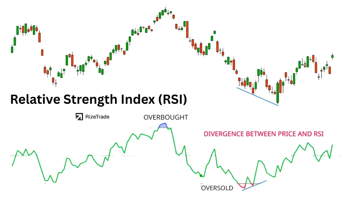
RSI measures momentum on a 0 to 100 scale. Traders use it to assess overbought and oversold conditions and to look for divergence before a possible reversal.
The Relative Strength Index measures the speed and size of recent price changes. A reading above 70 is commonly considered overbought, while a reading below 30 is commonly considered oversold.
An extreme RSI reading does not always mean that price will reverse. RSI can remain overbought during a strong uptrend or oversold during a strong downtrend. Divergence can provide additional context.
Bearish divergence: Price makes higher highs while RSI makes lower highs.
Bullish divergence: Price makes lower lows while RSI makes higher lows.
Trend filter: RSI above 50 can indicate bullish momentum, while RSI below 50 can indicate bearish momentum.
How Do Bollinger Bands Measure Volatility and Spot Breakouts?
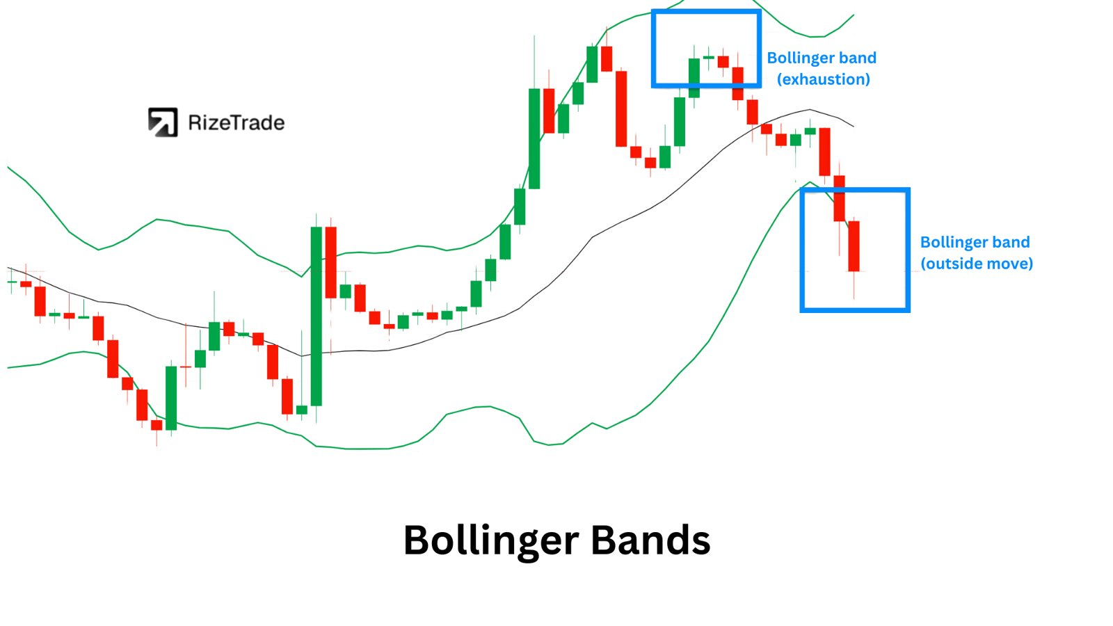
Bollinger Bands expand and contract with volatility. Traders use narrow bands to watch for a possible expansion and use price behavior around the bands to distinguish between trend and mean reversion.
Bollinger Bands use a middle SMA and two outer bands set a certain number of standard deviations above and below that average.
A squeeze occurs when the bands narrow. A squeeze can come before a large move, but it does not predict the direction. The breakout and follow-through provide that information.
Trend behavior: Price may follow the upper band during an uptrend and the lower band during a downtrend.
Mean reversion: A move outside a band that fails and returns inside the range may move back toward the middle band.
Double Bollinger Bands use 1 standard deviation and 2 standard deviation bands to create several zones. Price between the upper 1 and 2 standard deviation bands can show strong upward momentum. A move away from the 2 standard deviation band, especially with volume, may support a mean reversion trade.
How Do Fibonacci Retracements Find Support and Resistance Levels?
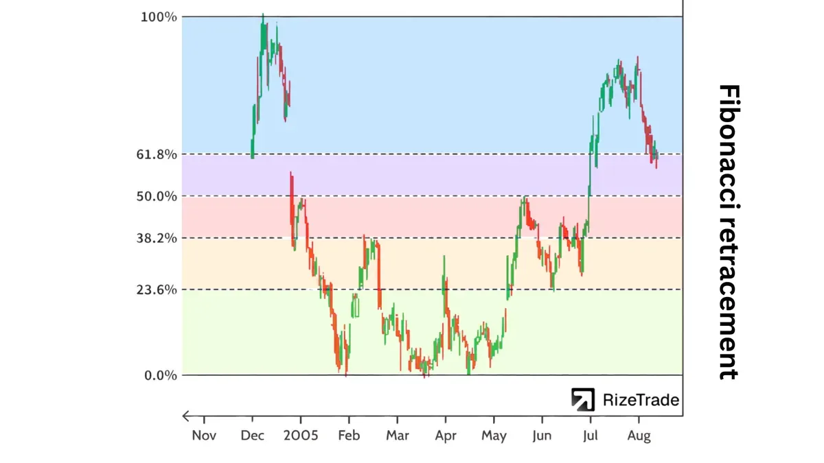
Fibonacci retracements mark common pullback levels inside a trend. Traders use them to plan entries, stops, and targets around possible support and resistance zones.
To draw Fibonacci retracement levels, traders mark a swing low and swing high in an uptrend, or a swing high and swing low in a downtrend. The 38.2%, 50%, and 61.8% levels receive the most attention.
Example: If a stock rises from $100 to $120, the 50% retracement is $110. Traders may watch that level for a reaction, particularly if it lines up with a moving average or previous resistance.
A Fibonacci level becomes more useful to a trading plan when it agrees with other information. A retracement that lines up with a moving average and a previous price level gives traders a defined area to watch rather than a single isolated number.
How Do Pivot Points Set Intraday Support and Resistance Levels?
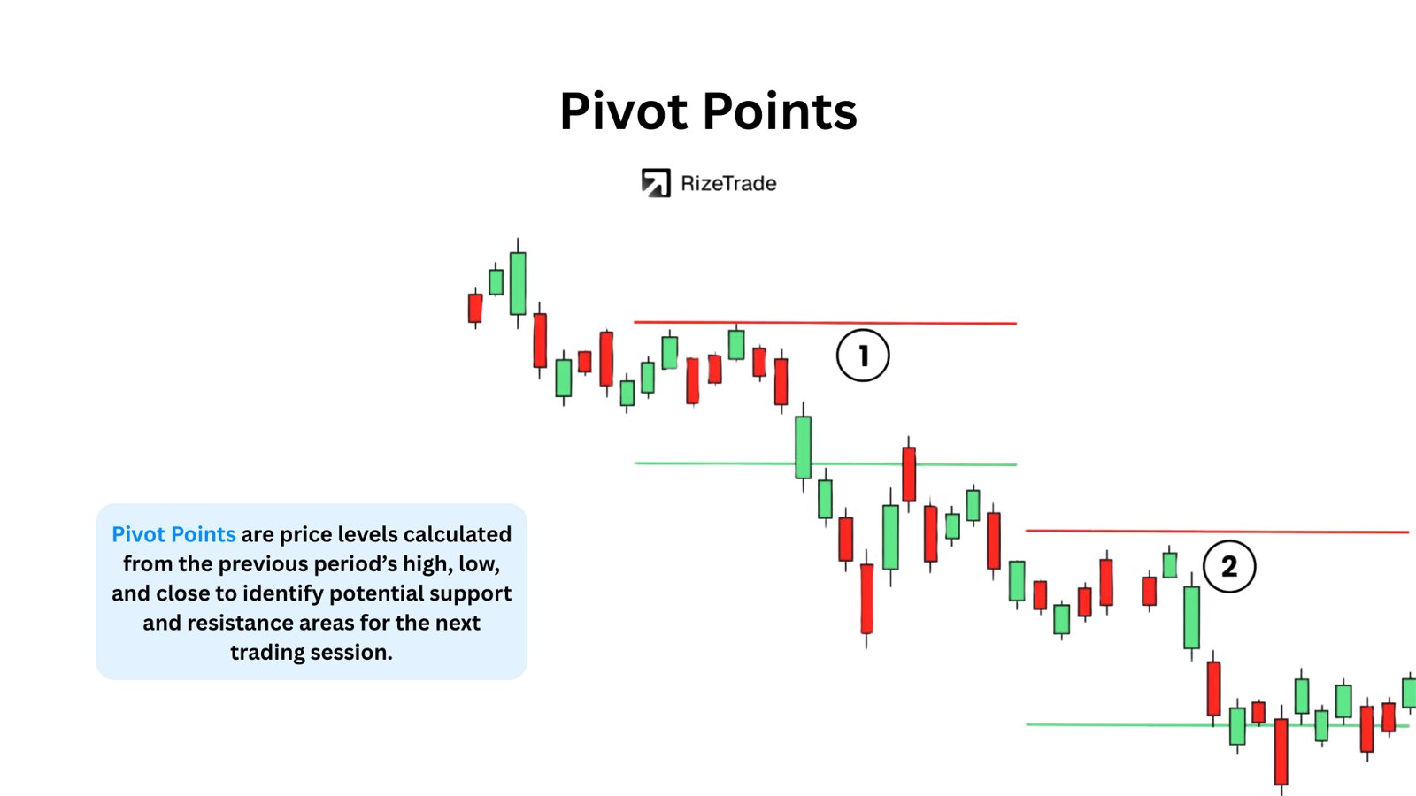
Pivot points calculate intraday support and resistance from the prior session's high, low, and close. Day traders use them to plan possible targets, reversals, and breakout levels before the session begins.
The central pivot, marked as P, acts as a reference for the day. R1 and S1 are common first resistance and support levels. R2 and S2 mark wider range extensions.
Volume read: A move toward R1 on declining volume may reject. A break through R1 with a volume increase may bring R2 into view.
Formula: P = (High + Low + Close) / 3
Pivot points rely on typical range behavior. Major news can change that range quickly, making the levels less useful for a time.
How Does On-Balance Volume (OBV) Spot Accumulation and Distribution?
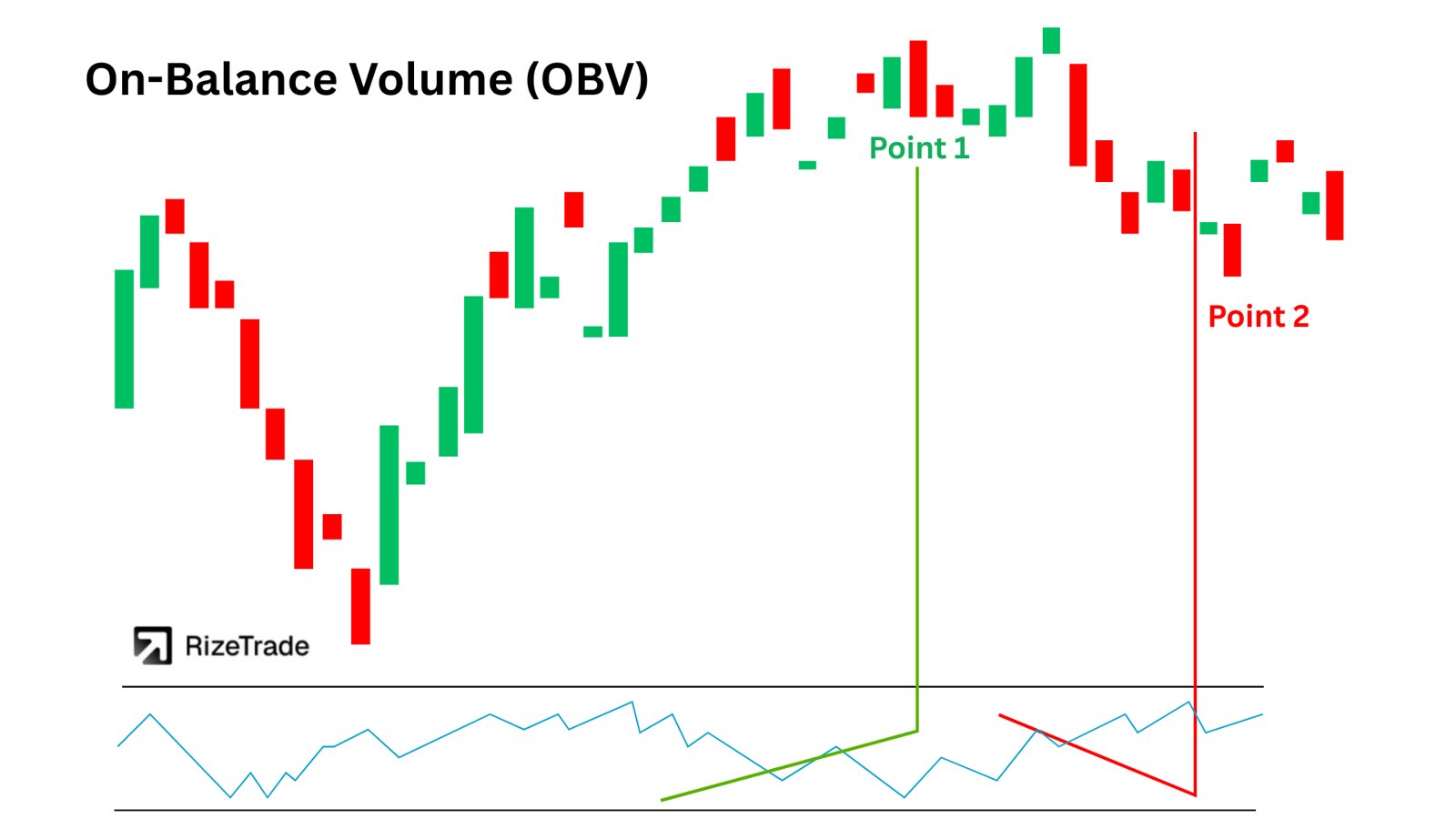
OBV tracks whether volume is flowing into up closes or down closes. Traders use it to confirm breakouts and look for accumulation or distribution when price is moving sideways.
On-Balance Volume adds volume on an up day and subtracts volume on a down day. The result is a cumulative line that reflects changes in buying and selling pressure.
When OBV rises while price consolidates, traders may read that as accumulation. Falling OBV during sideways price action may point to distribution.
OBV works best when the market has reliable volume data. Thinly traded stocks can produce less reliable signals.
How Does the Money Flow Index (MFI) Track Buying and Selling Pressure?
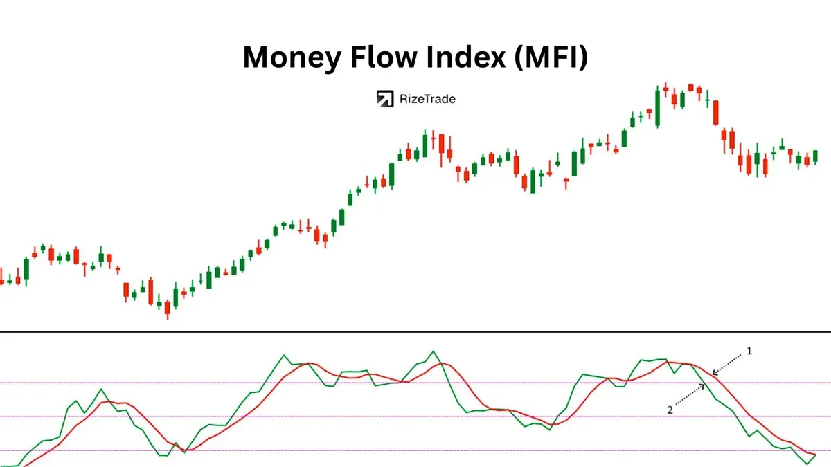
MFI is a volume-weighted momentum oscillator. Traders use it to assess whether price momentum is supported by trading volume.
The Money Flow Index combines price and volume data and produces readings from 0 to 100. It is often compared with RSI because both indicators use a bounded scale, although MFI includes volume.
MFI above 80 is commonly treated as overbought pressure. MFI below 20 is commonly treated as oversold pressure. Divergence can matter more than a single extreme reading.
Bearish divergence: Price makes new highs while MFI trends lower, suggesting that demand may be weakening.
Entry confirmation: Rather than buying only because MFI reaches an extreme, some traders wait for MFI to turn upward and cross back above 20.
How Do You Use ADX to Measure Trend Strength?
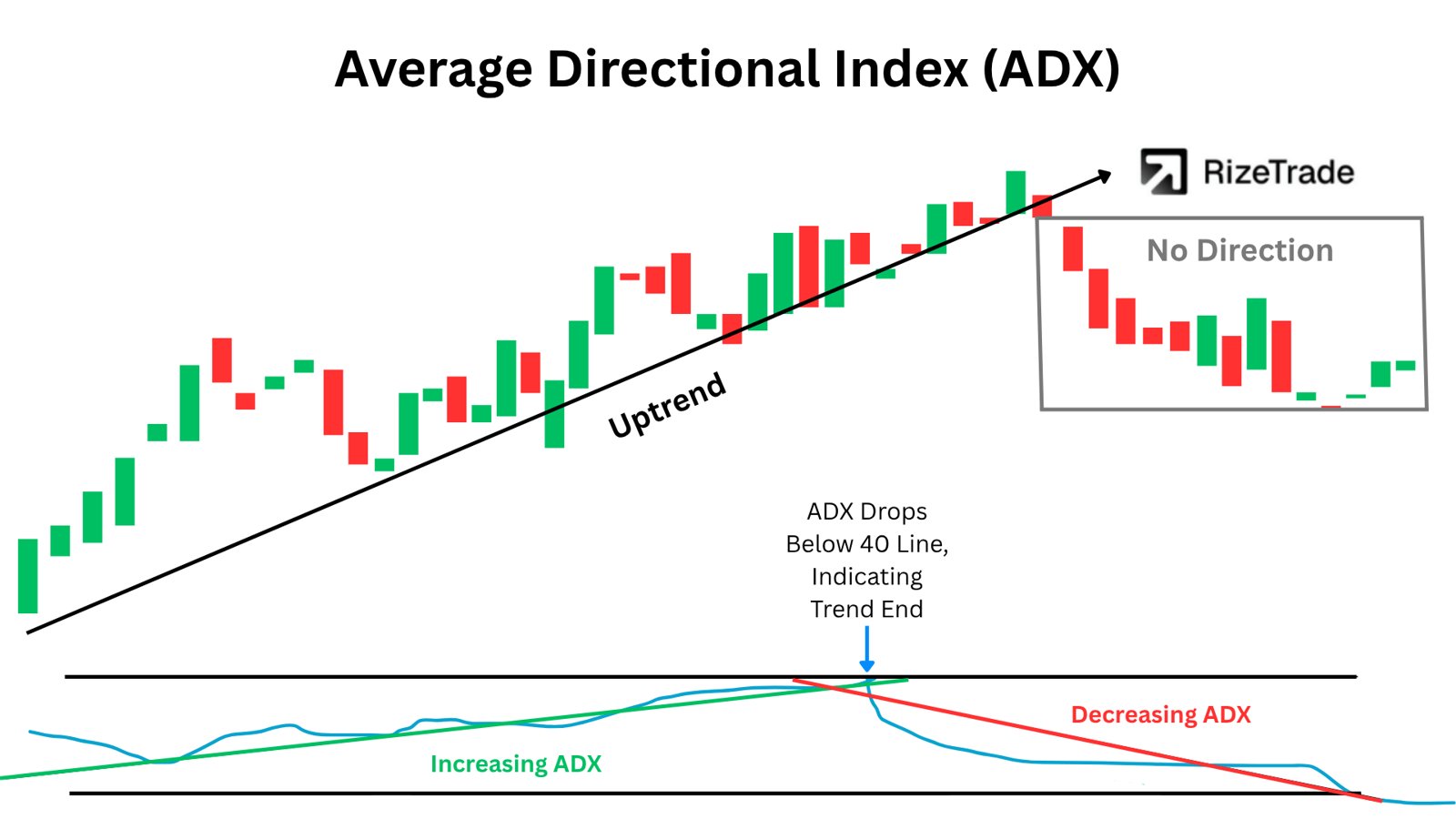
ADX measures trend strength, not direction. Traders use it to decide whether trend-following or mean reversion tools fit the current market.
The Average Directional Index measures how strongly price is trending, regardless of whether the move is up or down.
ADX above 25: The market is showing trending conditions.
ADX below 20: The market is showing ranging conditions.
The +DI and -DI lines add direction to the ADX reading. When +DI crosses above -DI while ADX rises above 25, upward trend conditions are strengthening.
ADX is not only useful after it reaches a high reading. A move upward from below 20 can show that a new trend is beginning. That signal still needs price and risk management to support a trade.
How Does the Stochastic Oscillator Signal Overbought, Oversold, and Divergence?
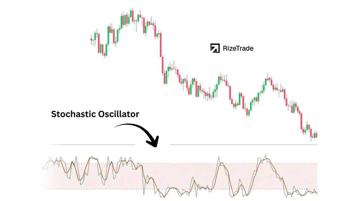
Stochastic compares the closing price with its recent range to show momentum shifts. Traders use it to time reversals in ranges and to look for divergence near swing highs and lows.
The Stochastic Oscillator produces readings from 0 to 100 by comparing the close with recent trading ranges. Readings above 80 are commonly considered overbought, while readings below 20 are commonly considered oversold.
The indicator has two lines, %K and %D. A crossover can be more useful when it occurs near a known support or resistance level than when it occurs in the middle of a range.
Example: In a range, Stochastic turning upward from below 20 near previous support may give traders a long trigger. A stop could sit below that support level.
How Does Williams %R Spot Overbought, Oversold, and Failure Swings?
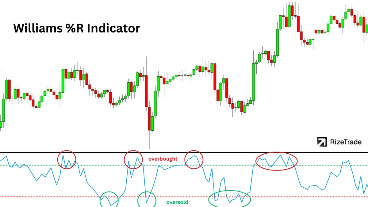
Williams %R is a fast momentum oscillator that highlights possible exhaustion. Traders use it to watch for turns and failure swings near previous extremes.
Williams %R compares the closing price with the recent trading range and moves between 0 and -100.
Overbought: Above -20
Oversold: Below -80
A failure swing occurs when momentum cannot reach a previous extreme. For example, if %R cannot reach the overbought zone during another upward push, the move may be losing momentum.
How Does CCI Identify Trend Continuation and Early Trend Shifts?
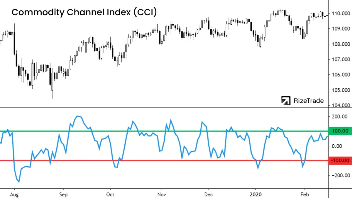
CCI measures how far price has moved from its statistical average. Traders use it to spot momentum expansion and possible trend changes near the zero line.
The Commodity Channel Index is an oscillator that measures price deviation from its average. Unlike RSI and Stochastic, CCI is not limited to a fixed upper and lower boundary.
Trend continuation: A break above +100 or below -100 can show expanding momentum.
Trend shift: A zero-line cross with follow-through can show a change in momentum.
Because CCI is not bounded, an extreme reading can signal trend strength rather than an automatic reversal.
How Does Parabolic SAR Signal Trend Reversals and Trailing Stops?
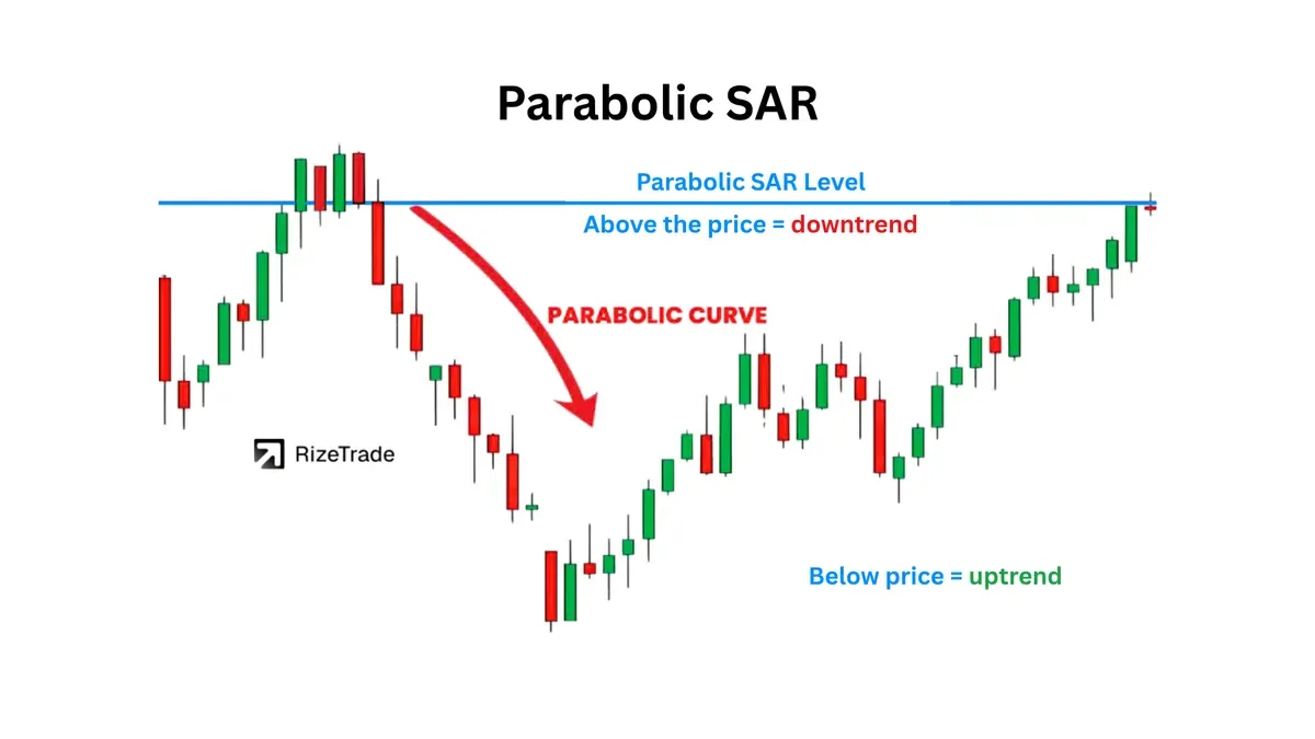
Parabolic SAR prints dots above or below price to track a trend. Traders use it as a trailing stop and as a quick way to identify the current trend state.
Dots below price suggest an uptrend. Dots above price suggest a downtrend. When the dots switch sides, Parabolic SAR signals a possible reversal and provides a level that traders may use when managing a trailing stop.
Parabolic SAR can produce repeated reversals when price consolidates. Combining it with a trend-strength tool such as ADX can help traders avoid taking every dot flip as a trade signal.
How Does the Ichimoku Cloud Identify Trend and Support or Resistance?
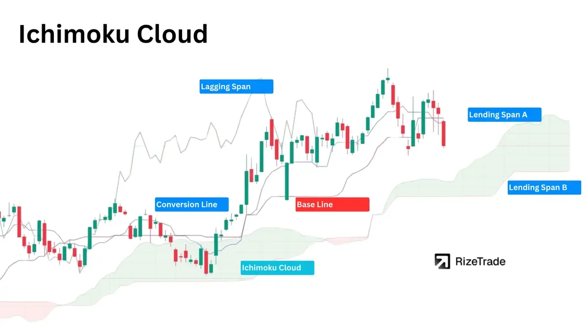
Ichimoku Cloud combines trend, momentum, and support or resistance in one view. Traders use the cloud to assess bullish or bearish bias and to find trend setups.
The Ichimoku Cloud uses five calculated lines. Together, the lines form the cloud, also called the Kumo, and show current and projected areas of support and resistance.
Price above the cloud suggests a bullish bias. Price below the cloud suggests a bearish bias. Price inside the cloud suggests a neutral or less defined market.
The cloud extends forward on the chart, giving traders projected support and resistance zones. Ichimoku tends to work best when price is moving clearly in one direction and can produce less useful signals in choppy conditions.
What Is a Weighted Moving Average (WMA) and When Is It Better?
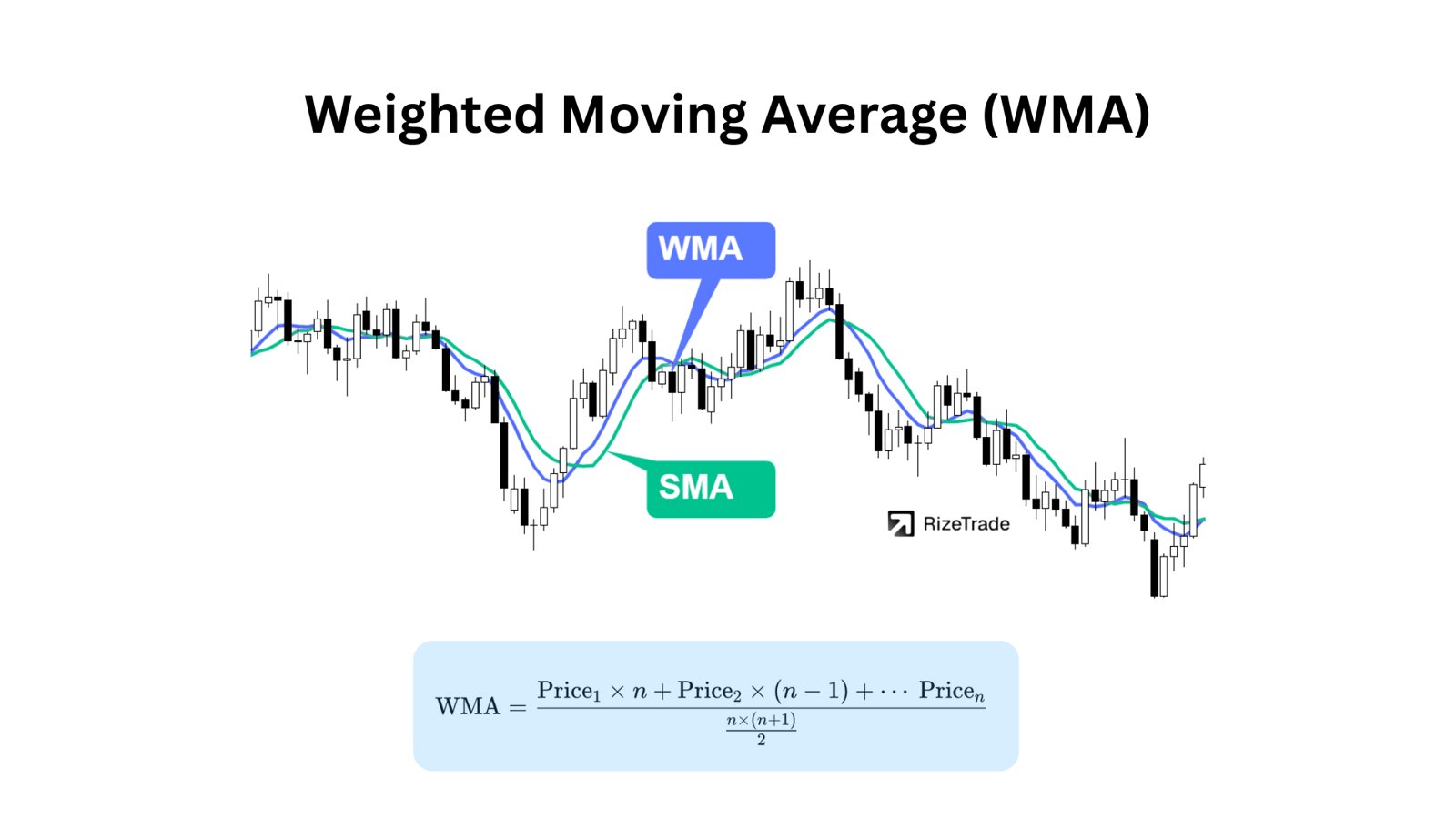
WMA gives more weight to recent prices through a linear weighting method. Traders use it when they want a faster average than the SMA without the stronger response of an EMA.
The Weighted Moving Average assigns the highest weight to the most recent price data and progressively less weight to older data.
WMA sits between SMA and EMA in responsiveness. It reacts faster than the SMA but may move less sharply than the EMA.
Example: On a 1-minute chart, some scalpers use a 10 and 20 WMA cross with volume confirmation to time short-term momentum shifts.
How Does the Hull Moving Average (HMA) Reduce Lag?
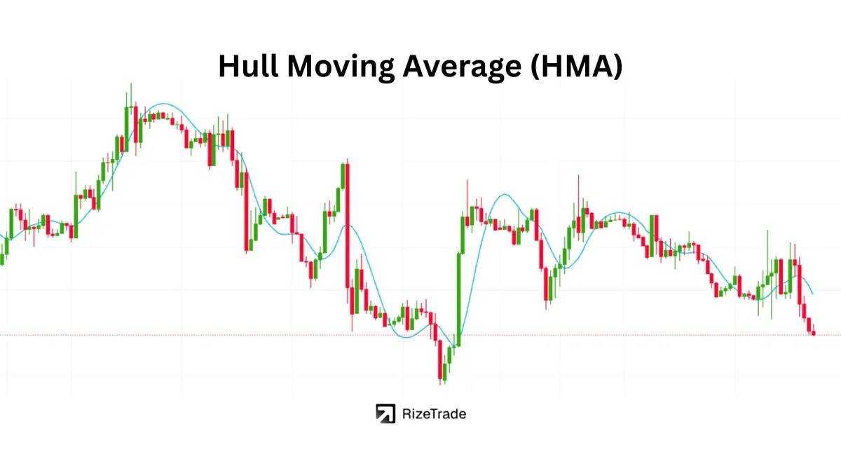
HMA is designed to stay smooth while reacting faster than many other moving averages. Traders use it to watch for earlier trend changes without taking on as much noise as a very fast average.
The Hull Moving Average uses weighted calculations and square-root periods to reduce lag while keeping the line smooth.
HMA can also help traders watch for trend exhaustion. When the line flattens after a steep move, momentum may be weakening.
What Is SMMA and How Does It Smooth Trend Noise?
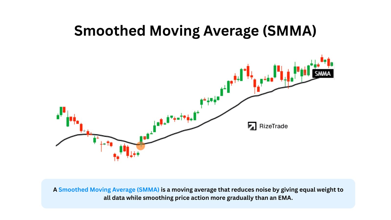
SMMA is a very smooth moving average that reduces short-term noise. Traders use it to follow longer trend direction and avoid reacting to every small price move.
The Smoothed Moving Average gives weight to a long history of price data while still giving somewhat more influence to recent prices. This produces a smoother line than many other moving averages.
SMMA can behave like a long-period EMA. Its slower response can reduce whipsaws, and the line may act as a longer-term area of support or resistance.
How Do You Turn Indicator Signals Into Repeatable Improvements Over Time?
Indicators become more useful when you track which signals work for your strategy and which do not. Record each setup, then review the results by setup type instead of judging every trade in isolation.
Log the setup: Record the indicator, settings, timeframe, market condition, and reason for entry.
Review in batches: Track win rate, average R multiple, drawdown, and expectancy for each setup.
Correct process errors: Look for late entries, positions that are too large for the ATR, and trades that ignore filters such as ADX.
A trading journal tracker or performance analytics dashboard can organize trades, tag indicator-based setups, and show the statistics behind your decisions. The point is not to add more indicators. It is to learn which small set of signals fits your process and apply them with consistent risk.